


A stock rises to a new high, slips, and climbs again. On its third rise, it cannot get back to that high. Is the rally losing strength?
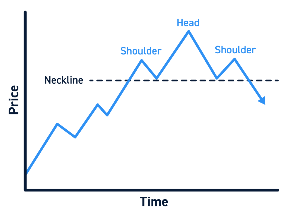
A Head and Shoulders pattern helps traders assess that possibility. It has three peaks: a left shoulder, a higher peak called the head, and a right shoulder below the head. The two dips between them form a neckline. If the price breaks below that line, traders may see it as a warning that the earlier uptrend is weakening. It is a warning, not a guarantee.
Quick Answer
A head and shoulders pattern is a chart shape that may appear near the end of a price rise. Its middle peak is higher than the peaks on either side. Traders join the two dips to draw a neckline, then watch whether the price breaks below it. The pattern helps them identify a possible change in trend, but false breaks can occur.
Table of Contents
- What Is a Head and Shoulders Pattern?
- How Does the Pattern Form?
- What Is the Neckline?
- A Nifty 50 Example
- How Do You Calculate a Target?
- Why Do Traders Watch This Pattern?
- What Are Its Risks?
- Tips for Beginners
- Head and Shoulders vs Inverse Head and Shoulders
- Common Mistakes
- Who Might Find It Useful?
- Frequently Asked Questions
What Is a Head and Shoulders Pattern?
A head and shoulders pattern is a possible sign that a rising price is starting to weaken. It appears after an uptrend, which is a period when a stock or index has generally been making higher highs.
The name describes what you see on the chart: one peak, a higher peak, and a third peak that does not reach the middle one. Buyers managed to push the price to a new high at the head. When they tried again, they fell short. That lower third peak is worth watching, but it does not confirm a fall by itself.
The two low points between the peaks matter just as much. They show where the price previously stopped falling. A line drawn through them is called the neckline.

How Does the Pattern Form?
- A stock or index has been rising. Without an earlier rise, the shape is not telling the usual reversal story.
- The left shoulder forms. Price reaches a high, then falls back.
- The head forms. Price climbs above the first peak, then falls again.
- The right shoulder forms. Price rises once more but stops below the head. Buyers have made a weaker attempt to push higher.
- Price tests the neckline. This is the area where the earlier dips ended. Traders watch to see whether it holds or breaks.zerodha+1
A chart will rarely look as neat as the drawing. The shoulders need not be the same height, and the two dips may end at different prices. Do not force the shape onto a chart where the turning points are hard to identify.
What Is the Neckline?
The neckline joins the low after the left shoulder to the low after the head. It marks an area of support: a price area where buyers previously stepped in and stopped a fall. If those two lows differ, the neckline slopes rather than running straight across the chart.
Suppose a stock dips to ₹980 after the left shoulder and ₹990 after the head. You would not have two identical low points to join with a flat line. When explaining or calculating a pattern, say which points you used.
Traders often wait for the price to close below the neckline. A closing price is the price at the end of the chosen trading period, such as a day. Waiting matters because a stock can move below the line during the day and climb back above it before the market closes. Even a closing break can fail.
A Nifty 50 Example
In October 2024, market analyst Ashish Kyal reported a topping head and shoulders breakdown on the Nifty 50 when the index was near 24,700. He reported a downside target of 23,300. Nifty later touched 23,263 on 21 November 2024 before recovering. This is an example of how one analyst read an Indian market chart at the time, not evidence that the pattern always predicts what happens next.
| Level described in the published account | Nifty 50 |
| Level near the reported breakdown | 24,700 |
| Analyst’s reported target | 23,300 |
| Reported low on 21 November 2024 | 23,263 |
The difference between 24,700 and 23,263 is 1,437 index points, or about 5.8% of 24,700. That is a movement between two reported levels, not a trader’s return. A person might have entered or exited at different prices, paid costs, or not traded at all.
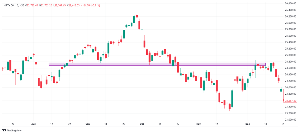
The published account does not specify the dated prices of the left shoulder, head, right shoulder, and both dips. For that reason, do not invent or label those points on an unrelated Nifty image. Use this as a reported market observation. The separate example below shows how to calculate a target from a fully specified set of prices.
How Do You Calculate a Target?
Once a pattern forms, some traders estimate how far price might fall. They measure the distance from the head to the neckline and project that distance below the neckline. This is called a measured move. It gives a price to watch, not a price the market must reach.truedata+1
Here is an imaginary Indian stock example. ABC Ltd and its prices exist only to explain the calculation; they are not a trading suggestion.
| Part of the chart | Illustrative price |
| Left shoulder peak | ₹1,160 |
| Head peak | ₹1,200 |
| Right shoulder peak | ₹1,155 |
| Flat neckline | ₹1,100 |
| Closing price below neckline | ₹1,090 |
The head is ₹100 above the neckline: ₹1,200 − ₹1,100 = ₹100. Projecting that distance below ₹1,100 gives an estimated target of ₹1,000.
A target is only one side of the plan. A trader considering a short position, a trade intended to benefit if the price falls, would also need to decide what happens if the price rises. Suppose that person considers ₹1,090 as an entry and ₹1,165 as a planned exit if the idea fails. The difference is ₹75 per share. On 20 shares, that would be ₹1,500 before charges if the exit occurs at exactly ₹1,165.
In a fast move, an order may fill at a different price, so the actual loss could be higher.
Why Do Traders Watch This Pattern?
The pattern gives traders three things to check on a chart.
- The right shoulder: Did the latest rise stop below the previous high?
- The neckline: Has price fallen below an area that held during the earlier dips?
- The risk: If the price rises instead, what level would make the trader leave the position?
It can also prompt someone who already owns a stock to review it. A chart signal does not replace the reasons they invested or provide a complete view of the company.
Some traders also look at trading volume, meaning the quantity traded during a period. Volume can add context to a price break, but a busy trading day does not prove that a fall will continue.
What Are the Risks?
The biggest risk is a false break. Price can fall below the neckline and then recover. Someone who acts on the break may find that the expected downtrend never develops.truedata+1
There are other reasons to be careful:
- Different traders may draw different necklines. The lows are not always clear, especially on a choppy chart.
- The target can be missed. Price may fall part of the way and then turn upward.
- The break may come after a large fall. An entry at that point can leave less room before the estimated target.
- A stop and the pattern’s failure point may differ. A short trader may plan to exit above the right shoulder. A move above the head would more clearly contradict the wider three-peak shape, but waiting that long could mean a much larger loss.
- Leverage adds risk. A leveraged position gives exposure to a larger trade than the money put up. If the market moves against it, losses can grow quickly.
No chart pattern removes these risks. Its job is to help you describe what you see and plan for more than one outcome.
Tips for Beginners
- Start with a daily or weekly chart where the three rises are easy to distinguish.
- Mark the peaks and dips before drawing a neckline. If you cannot mark them clearly, move to another chart.
- Decide what you mean by a break before watching the next price move. For example, will you look for a daily close below the neckline?
- Compare the possible loss with the estimated target. A distant target does not make an oversized risk acceptable.
- Practise on older charts without looking at the candles that came later. It is much easier to spot a pattern after you already know the result.
Head and Shoulders vs Inverse Head and Shoulders
The regular pattern has three peaks and is watched after a rise. The inverse pattern has three troughs, or low points, and is watched after a fall. Traders look for a move above the neckline in the inverse version.
| Feature | Head and shoulders | Inverse head and shoulders |
| Earlier price move | Rising | Falling |
| Shape | Three peaks; middle peak highest | Three troughs; middle trough lowest |
| Possible change | Rise may turn into a fall | Fall may turn into a rise |
| Neckline move watched | Break below | Break above |
| Main risk | Price recovers after breaking below | Price falls back after breaking above |
Common Mistakes to Avoid
- Acting at the right shoulder alone. A lower third peak is a warning; price has not yet broken the neckline.
- Drawing a pattern where there is no earlier rise. The context matters as much as the shape.
- Treating a sloping neckline as one exact price everywhere. Show where you measured it, particularly when working out a target.
- Assuming the target is a promise. It is an estimate based on the pattern’s height.
- Ignoring the loss if price rises. Decide on your risk before considering a position.
- Copying an annotated chart without checking its dates. Make sure the image shows the same market move described in the text.
Who Might Find It Useful?
The pattern can help people who follow daily or weekly charts assess whether a price rise is weakening. A trader might use it to frame a possible setup, while an investor might use it as one prompt to review a holding.
It is less useful when the peaks are unclear, or the price has moved sideways for a long time. Beginners do not need to trade a pattern to learn from it. First, try to identify the shape and the neckline on older charts, then check how often your reading would have held up.
Conclusion
A head and shoulders pattern shows three attempts to rise, with the middle peak highest and the last one weaker. The neckline joins the dips between those peaks. A break below it may warn of a fall, but the price can recover, and the estimated target may never be reached. The reported Nifty 50 example shows how the pattern has been discussed in an Indian market setting.
Frequently Asked Questions
1. Is a head and shoulders pattern bullish or bearish?
The regular head and shoulders pattern is usually read as a possible bearish sign after a rise. The inverse version is usually read as a possible bullish sign after a fall.
2. When is the pattern confirmed?
Traders commonly look for the price to break below the neckline, often using the closing price. That strengthens the pattern reading, but it cannot guarantee a continued fall.
3. How do I draw the neckline?
Join the low after the left shoulder to the low after the head. If those lows are at different prices, the line will slope.
4. How do you calculate the target?
Measure the distance from the head to the neckline, then project it below the neckline. The result is an estimate rather than a guaranteed price.
5. Where might a trader put a stop-loss?
One common approach for a short trade is to plan an exit above the right shoulder. That level affects how much the trade could lose, and an order may execute at a different price in a fast market.
6. Can the pattern fail after a neckline break?
Yes. Price can break below the neckline and then climb back above it. This is why traders account for the possibility that their reading is wrong.
7. Can investors use the pattern?
Yes, to help decide when a rising stock deserves another look. The pattern alone does not assess a company’s business or make a buy-or-sell decision for an investor.